Tuesday, 18 January 2011
Double page spread evaluation
I also used a photo that I didn't use for my front cover to go on my Double Page Spread, I also did this to have continuity through out my magazine. I also used the same colours to have continuity through out my magazine.
Contents page evaluation
I used the photo's that i didn't use for my front cover on the contents page, to show continuity through-out the magazine
Continuity
As you can see, i have kept continuity running through my magazine with the mentioning of the girl on my front cover on the contents page and the double spread being about her. I plan to improve the double page spread and the contents page, but i blogged these to give you and I an idea on what the final copy would look like.


Monday, 17 January 2011


Friday, 14 January 2011

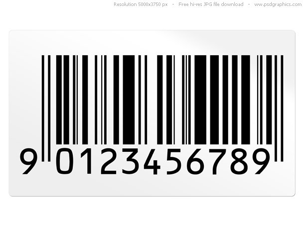
Barcode's
I chose the bottom barcode, I think it looks more realistic and I think it looks like a barcode you would find on a magazine.
Masthead
For my masthead i chose, 'The Chord' I chose this because I think it suited the magazine best and the colour also goes with what my model is wearing in the photo's.


Wednesday, 5 January 2011
Target Audience
My target audience for my magazine is males and females, of the younger generation who like Indie/Alternate rock music. This is my target audience because people of the younger generation are more likely to listen to this type of music and are more likely to go to a nightclub and listen to this type of music. The price of the magazine will be £2.98 which i think is a reasonable price for a music magazine and also afordable for people of the younger generation and i think they would be prepared to pay that for a music magazine.

Subscribe to:
Posts (Atom)